I’ve been frightened and shocked by the Covid-19 epidemic’s rapid spread. I’ve been trying to make sense of how we’re doing in our fight against it, and many of the graphs that I’ve seen on the web haven’t helped much. I started making some of my own, using public databases. They’ve helped me get a handle on what’s going on, and maybe they’ll help you.
I’m no expert on epidemiology. Nor do I have access to huge databases. There are websites run by people who fall into one of both of those categories. Here’s a snapshot of the US numbers. Here’s a worldwide look. And here’s the Johns Hopkins site.
All politics is local. So, in a sense, is all epidemiology. So I’m going to look at three levels: the US, California, and Monterey County. There are many possible metrics. I’m going to look at confirmed cases and confirmed deaths. There is reason to believe that confirmed cases is dramatically undercounted. It is probably true that confirmed deaths is also undercounted, but not as heavily. It is also true that the availability of tests has affected confirmation ability, and tests have gradually become more available, which would argue for a downwards bias to both metrics in older data.
Here is a plot of cumulative US cases as of noon PDT today:
The y-axis is logarithmic, so exponential growth would appear as a straight line. It is apparent that in the last two weeks, there has been some considerable flattening.
If instead of looking at the cumulative numbers, we look at the daily new cases and deaths, we get this:
The number of cases has been more or less flat for about two weeks. The number of deaths started to flatten later. I would guess that a new case that results in a fatality probably takes on average 10 days to do so, which could explain the lag. However, there have been reports that the amount of testing has fallen by about 30% in the last week or so, which could partially explain the observed flattening in daily new cases.
Here is the daily percentage increase in the cumulative counts:
The best you can do on this plot is zero. You can see that both cases and deaths are falling, with the increase in cumulative deaths starting higher and falling faster.
Now I’ll look at California. There are several sets of numbers available. I’ll show you the California Department of Public Health ones:
The flattening is not as dramatic as with the national numbers, but the counts are much lower.
Here are the California daily percentage increases:
The best you can do on the above plot is zero.
Since this is daily deaths and cases compared to the day before, you can get — and want to see — negative numbers. It’s clear things are getting better, in the sense of bending the curve, but we have yet to reach sustained decreases.
In Monterey County:
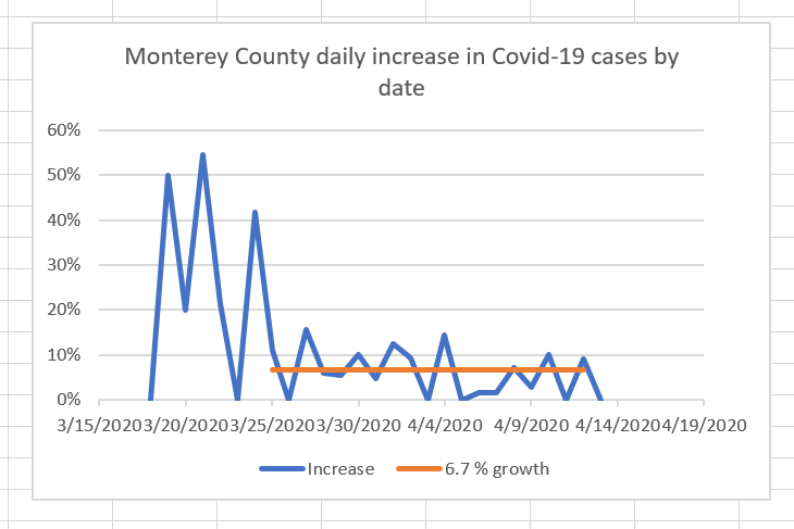
The curve for the last three weeks looks approximately exponential, with a 6.7% growth rate. Maybe it’s flattening. Maybe it’s not.
The daily increases curve bears that out, but actually looks a bit better.
In a week or two, I’ll update these curves.


Thanks Jim Kasson — if anyone can wrestle those raw numbers to the ground, it would be you! Thanks for making this really helpful data available.